.png%3Fw%3D200)
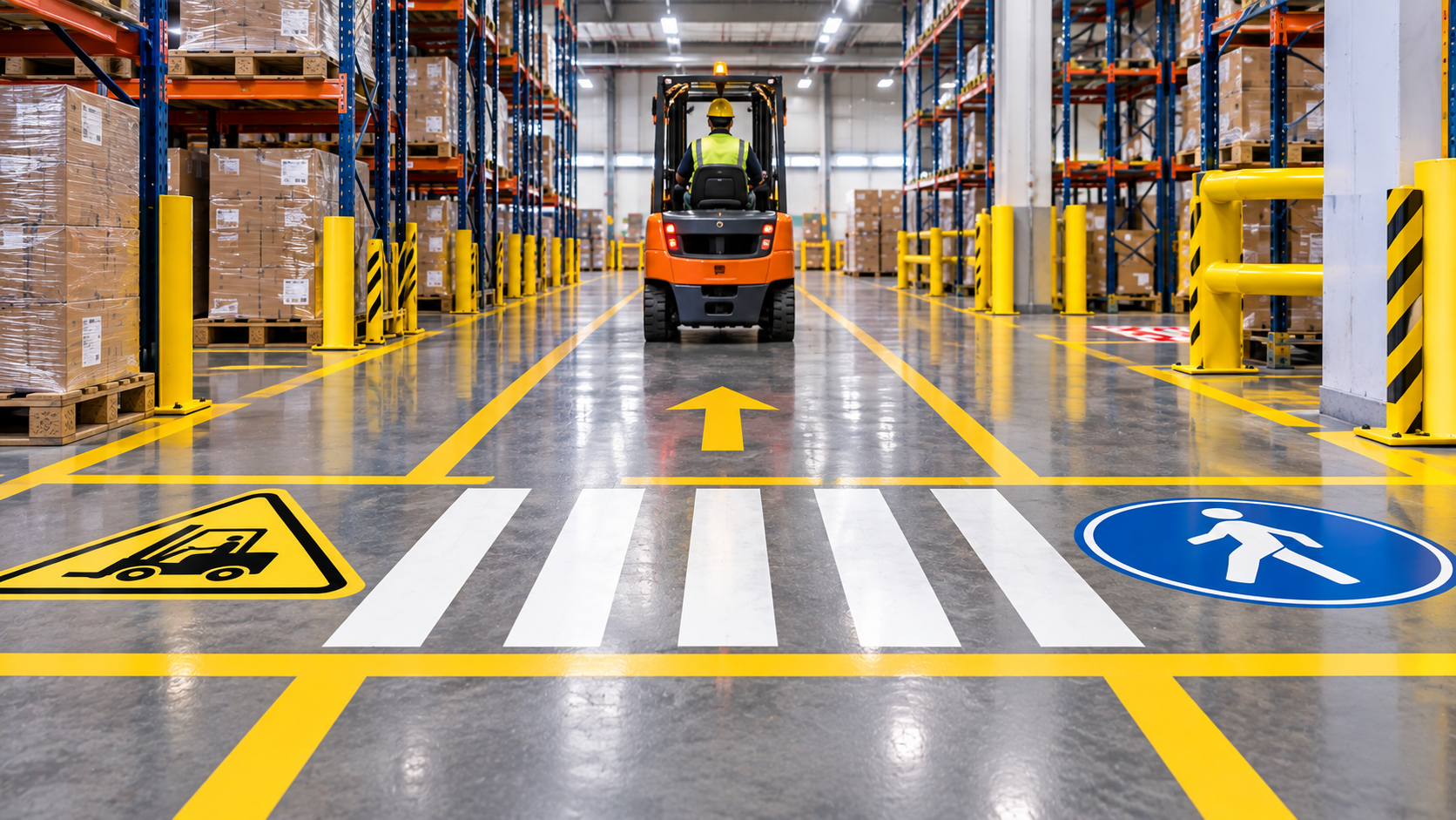
Industrial Floor Signs: Safety Colors, Types & Placement Guide

For anyone asking what color are warning signs, the short answer is orange: OSHA recommends orange or predominantly orange for WARNING tags, with contrasting text or symbols. Yellow is associated with CAUTION, while red identifies DANGER, so the correct color depends on the hazard level and the message being communicated.
In warehouses, factories, production areas, and distribution centers, color is only one part of an effective visual safety system. Industrial floor signs also need clear wording, suitable placement, strong visibility, and enough durability to remain readable under foot traffic and material-handling equipment.
A well-planned floor marking system can help workers recognize hazards, follow designated routes, locate equipment, and understand restricted areas without stopping to interpret complicated instructions.
This guide explains safety colors, common floor sign types, placement principles, sizing, and how to choose the right option for different areas of an industrial facility.
Why Safety Colors Matter for Industrial Floor Signs
Industrial facilities can contain forklifts, loading areas, electrical equipment, storage racks, pedestrian routes, machinery, emergency equipment, and changing work zones. Workers often need to understand their surroundings within seconds.
Color gives them an immediate visual clue.
The purpose is not to replace the written message on a sign. Instead, color supports the message by making certain types of information easier to recognize from a distance.
For example, a worker approaching a red DANGER message should understand that the situation is more serious than an ordinary information marker. A yellow CAUTION sign signals a potential hazard that requires attention. Orange WARNING markings can indicate a hazard level between caution and danger when that classification is appropriate.
OSHA distinguishes these categories rather than treating all hazard communication as interchangeable. Its general-industry rules specify red, black, and white for danger signs and yellow with black for caution signs. OSHA also recommends orange for warning tags.
That distinction matters when planning industrial floor markings because simply choosing the brightest available color does not automatically create a clear safety system.
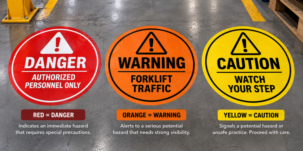
Industrial Safety Colors and What They Mean
Safety colors work best when they are used consistently throughout the facility. Employees should not have to guess whether the same color represents a forklift lane in one department and a storage area in another.
The following table provides a practical overview of widely recognized safety-color applications.
| Safety Color | Common Meaning | Typical Industrial Use | Best Used When |
| Red | Danger, stop, fire-related identification | Immediate hazards, stop messages, fire equipment areas | The hazard requires immediate attention |
| Orange | Warning | Hazard warnings, machinery-related hazards, higher-risk areas | A serious potential hazard needs strong visibility |
| Yellow | Caution | Traffic areas, trip hazards, aisle boundaries, caution zones | Workers need to slow down or use additional care |
| Green | Safety information | First aid, safe conditions, safety-related directions | Identifying safety resources or information |
| Blue | Information or notice | Facility instructions and operational information | Communicating important non-hazard instructions |
| White | General organization | Work areas, storage boundaries, pathways | Creating visual organization and separation |
The exact application should always match the facility’s hazard assessment, applicable requirements, and internal safety program.
This is especially important because a floor marking may serve two purposes at once. A yellow boundary line, for example, could organize traffic while a nearby sign explains the specific hazard workers need to avoid.
Warning, Caution, and Danger: Which Option Is Best?
The best option depends on how severe the hazard is and what action a worker needs to take.
A DANGER message should not be used simply because red looks highly visible. OSHA describes danger signs as indicating immediate danger that requires special precautions. CAUTION signs are used for potential hazards or unsafe practices where proper precautions should be taken. OSHA also permits WARNING tags for a level between caution and danger under its general-industry tag provisions.
That creates a useful decision framework.
✅ Choose DANGER when an immediate serious hazard exists.
✅ Choose WARNING when a significant hazard needs stronger attention than an ordinary caution condition.
✅ Choose CAUTION when workers need to recognize a potential hazard or unsafe practice and proceed carefully.
The wording must support the color. A bright floor sign that only says “WARNING” is less useful than one that explains what the worker is being warned about, such as forklift traffic, overhead movement, restricted access, or electrical equipment.
For facilities building or replacing their visual marking system, browsing purpose-specific industrial floor signs can make it easier to match messages, shapes, colors, and dimensions with individual work areas.
What Are Industrial Floor Signs?
Industrial floor signs are visual markers installed directly on floors to communicate instructions, hazards, traffic rules, equipment locations, restricted zones, and organizational information.
Unlike a wall sign, a floor marker appears directly in a worker’s path of travel. That makes floor signs particularly useful in large facilities where employees, visitors, and vehicle operators may spend much of their attention looking toward aisles, intersections, workstations, and nearby equipment.
Common messages can include:
- STOP
- CAUTION
- KEEP CLEAR
- DO NOT BLOCK
- FORKLIFT TRAFFIC
- PEDESTRIAN CROSSING
- FIRE EXTINGUISHER
- ELECTRICAL PANEL
- EXIT directions
The goal is not to cover a facility with signs. Too many visual signals can become background clutter.
A better system places clear messages at decision points, hazard approaches, intersections, equipment zones, and locations where workers need information before taking their next action.
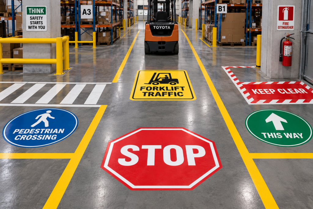
Different floor signs communicate different actions at the point where workers need them.
Types of Industrial Floor Signs
The right type depends on what the floor marking needs to accomplish.
Safety and Hazard Floor Signs
These signs alert workers to conditions requiring additional attention. Examples include forklift traffic areas, machinery zones, electrical hazards, loading areas, and places where pedestrians approach moving equipment.
The best safety sign tells the worker both what the hazard is and what to do about it.
“CAUTION: FORKLIFT TRAFFIC” gives more useful information than a generic caution symbol because the employee immediately understands the reason for the warning.
Traffic and Stop Signs
Warehouses often function like small transportation networks.
Forklifts, pallet jacks, carts, employees, contractors, and visitors may share nearby routes. Floor-mounted STOP signs and directional markings can reinforce traffic rules at intersections and crossing points.
These signs are particularly helpful where traditional wall-mounted signs could be blocked by racks, inventory, equipment, or moving vehicles.
Keep-Clear and Restricted-Area Signs
Some areas must remain accessible even when warehouse space is limited.
Electrical panels, emergency equipment, fire extinguishers, doors, loading zones, and designated pathways can benefit from clear floor messaging that tells employees not to place pallets, containers, or equipment in the marked space.
For additional examples of how markings can support warehouse traffic and organization, see this warehouse floor signs guide.
Directional and Wayfinding Signs
Arrows, exit directions, aisle identifiers, and pedestrian route markings help employees understand where they should move.
They can be especially useful in large warehouses where identical aisles, racks, and work areas make navigation difficult for new employees or visitors.
5S and Workplace Organization Markings
Floor markings also support organization rather than hazard communication alone.
A 5S system may use shapes, corners, lines, and floor markers to define where pallets, carts, containers, equipment, or materials should be returned.
The advantage is simple: employees can see immediately whether something is in its proper location.
How 5S Floor Markings Improve Visual Organization
5S focuses on creating an organized, repeatable workplace. Floor markings support that goal by giving physical items clearly defined locations.
Imagine a staging area that can hold six pallets. Without visual boundaries, operators may leave pallets at slightly different angles or distances each shift. Over time, the staging zone can expand into an aisle.
Marked corners or outlines create a visible standard.
Employees do not need to measure the location or ask where the pallet belongs. They can simply align it with the marking.
A facility can use 5S floor markings for storage areas, equipment positions, work cells, carts, containers, pallets, and other repeat-use locations.
The most effective approach is consistency. If blue represents one storage category, for example, changing the same blue markings to mean something completely different nearby may create confusion.
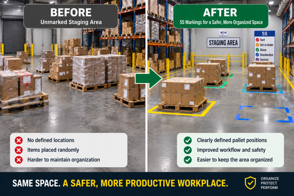
5S markings create visible locations for materials and equipment.
Where Should Industrial Floor Signs Be Placed?
Placement should give a worker enough time to see, understand, and respond to the message.
That usually means positioning a sign before the hazard or decision point rather than directly underneath it.
Consider a forklift intersection. A pedestrian floor sign placed only inside the crossing gives the worker very little advance warning. Moving it farther back can provide time to slow down, look for traffic, and follow the required procedure before entering the intersection.
Visibility also matters.
Avoid locations where pallets, carts, doors, equipment, or routinely parked vehicles cover the sign. A perfectly designed safety sign is ineffective when it cannot be seen.
The surface should also be considered. Dirty, damaged, oily, uneven, or heavily deteriorated floors may reduce adhesion and shorten the service life of a floor marker.
Practical Placement Guide
| Location | Recommended Floor Message | Placement Approach | Why It Helps |
| Forklift intersection | STOP / FORKLIFT TRAFFIC | Before entering the crossing | Gives pedestrians and operators reaction time |
| Electrical panel | KEEP CLEAR / DO NOT BLOCK | Around the required access area | Discourages temporary storage |
| Pedestrian crossing | PEDESTRIAN CROSSING | On approaches and crossing zone | Makes shared traffic areas more obvious |
| Loading area | CAUTION / LOADING ZONE | Before the active work zone | Alerts workers before entering |
| Emergency equipment | DO NOT BLOCK | Directly around access area | Keeps critical equipment visible and accessible |
| Storage location | 5S boundary or identification | Around designated footprint | Keeps materials in their intended location |
For a broader look at different safety applications, the safety floor signs guide can help when planning a facility-wide marking approach.
How to Choose the Right Floor Sign Size
Bigger is not automatically better.
The correct size depends on viewing distance, floor space, traffic speed, message length, and the amount of surrounding visual clutter.
A smaller sign may work well directly in front of a workstation where employees walk slowly. That same sign could be difficult to notice in a wide forklift aisle where operators are moving and viewing markings from farther away.
Start with the viewing environment.
Ask whether the person needs to read the message while standing nearby, walking toward it, or operating equipment. The greater the viewing distance and movement speed, the more important strong contrast, simple wording, and adequate sign dimensions become.
The message should remain easy to recognize without requiring employees to stop and study it.
Long sentences usually do not belong on floor signs. Short instructions such as “STOP,” “KEEP CLEAR,” or “PEDESTRIAN CROSSING” communicate the required action much faster.
How to Build a Better Floor Sign System
A good floor marking plan should operate as a system rather than a collection of unrelated signs purchased over time.
Begin by walking through the facility from the perspective of someone unfamiliar with it.
Where do pedestrians meet forklifts? Where do employees hesitate because directions are unclear? Which emergency or electrical areas tend to become blocked? Where are pallets frequently stored outside their intended boundaries?
These observations identify locations where visual communication can improve consistency.
Next, standardize the meaning of colors, shapes, and terminology.
If one department uses “KEEP CLEAR” and another uses “DO NOT BLOCK” for the same type of location, consider whether one standard message could make training easier.
Finally, review the markings periodically.
Floor signs operate in a harsher environment than many wall signs. Forklift traffic, wheels, dragging pallets, dirt, cleaning equipment, chemicals, and ordinary wear can damage their surfaces.
Replace a sign when the message is no longer easy to read or when damage makes the marker less effective.
Common Floor Sign Mistakes to Avoid
One common mistake is relying on color alone.
Workers should not need to memorize that a particular shade represents a specific hazard without any supporting message. Use clear wording, recognizable symbols where appropriate, and consistent facility standards.
Another mistake is placing signs after the decision point. A STOP marker located beyond an intersection cannot effectively tell an operator to stop before entering it.
Facilities should also avoid excessive markings. When almost every square foot has a color, symbol, line, or message, truly important information can become harder to notice.
Finally, do not assume a floor sign by itself controls a hazard.
Floor signs are visual communication tools. Depending on the risk, a facility may also need guarding, barriers, training, traffic controls, procedures, PPE, equipment changes, or other protective measures.
📌 Practical tip: Photograph key aisles during a marking audit. Reviewing the photos away from the work area often makes inconsistent colors, blocked signs, unnecessary markings, and missing decision-point warnings easier to identify.
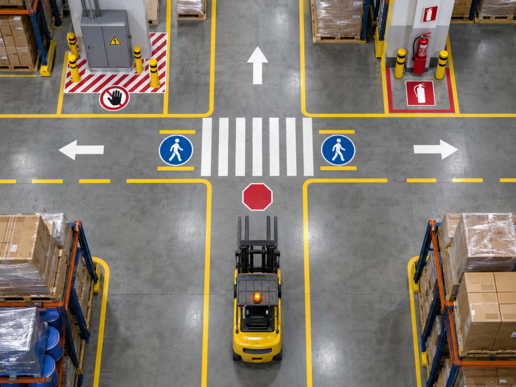
Place signs before workers reach the hazard or decision point.
Which Floor Sign Option Is Best?
The best industrial floor sign is the one that communicates the required action clearly in the actual environment where it will be used.
For hazard communication, start with the hazard level and required safety message.
For traffic management, focus on visibility, approach direction, stopping points, and interactions between pedestrians and vehicles.
For 5S organization, prioritize consistent colors and clearly defined equipment or material locations.
For keep-clear areas, choose markings large enough to define the entire protected space rather than relying on a small label that can easily be missed.
Durability should also match traffic conditions. A quiet stockroom does not create the same wear as a distribution center aisle with frequent forklift and pallet traffic.
This is why choosing by appearance alone is rarely the best method. Purpose, visibility, consistency, placement, and durability should guide the decision.
Final Takeaway: what color are warning signs
Orange is the recognized color commonly associated with WARNING in U.S. industrial safety conventions, while yellow represents CAUTION and red represents DANGER. The differences help communicate hazard severity, but an effective workplace marking system should never depend on color alone.
Industrial floor signs work best when the message, color, size, placement, and surrounding traffic pattern all support the same instruction.
For warehouses and manufacturing environments, start by identifying the action workers need to take. Then choose a sign that makes that action immediately understandable before the person reaches the hazard, intersection, restricted area, or equipment zone.
A consistent system is easier to recognize, easier to teach, and easier to maintain than a collection of unrelated markings.
Frequently Asked Questions
What are industrial floor signs used for?
Industrial floor signs are used to communicate safety instructions, traffic rules, hazard warnings, equipment locations, and workplace organization directly on the floor. They are common in warehouses, manufacturing plants, loading areas, and distribution facilities because workers naturally see the markings as they approach an aisle or work zone. Typical applications include forklift warnings, pedestrian crossings, stop points, keep-clear zones, emergency equipment access, directional arrows, and designated 5S storage positions.
What types of industrial floor signs are available?
Common industrial floor sign types include hazard signs, traffic signs, directional markers, keep-clear signs, emergency-equipment markings, and 5S organization signs. The right type depends on the action employees need to take. A forklift intersection may need STOP or crossing warnings, while an electrical panel may need a clearly defined DO NOT BLOCK area. Warehouses can also use arrows, aisle identifiers, pallet-position markings, and pedestrian-route signs to make movement and organization easier to understand.
Where should industrial floor signs be placed?
Industrial floor signs should normally be placed where workers can see and understand the message before reaching the hazard or decision point. For example, a forklift warning should appear on the approach to an intersection rather than only inside the crossing. Signs should also remain free from pallets, carts, parked equipment, doors, and other obstructions. Consider normal travel direction, viewing distance, lighting, floor condition, and traffic speed when deciding on the final position.
How do you choose the right size for a floor sign?
Choose a floor sign size based on viewing distance, traffic speed, available space, message length, and surrounding visual clutter. Small signs can work near slow-moving workstations, while wider aisles and forklift routes may require larger, simpler markings that are recognizable sooner. Keep wording short and use strong visual contrast. The goal is to let workers identify the instruction quickly enough to react before they reach the marked hazard, crossing, or restricted area.